
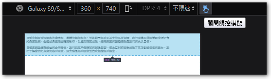
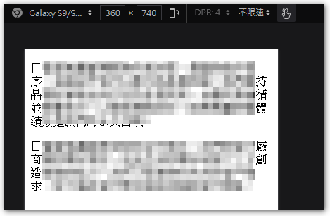
 剛剛在調 CSS 語法時,不知道為什麼,解析度模擬成手機解析度後,版型沒有呈現 RWD 該有的效果,一開始以為 @media screen 語法沒有生效,反覆測試後,發現卻是因為 width 語法沒有跟著解析度的比例變動 (已經設成 auto 或用 max-width)。後來試出是要關閉「網頁開發者」模式裡的”觸控模擬”功能,才會正常,目前還不知道為什麼會這樣影響。
Firefox
Enable touch simulation
Disable touch simulation
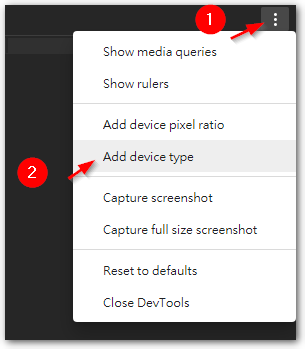
Edge (Chromium) Adjustment method
1. Click "…」
2. Select "Add device type"
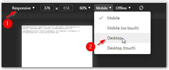
1. Device type select "Responsive"
2. In "device type" change from “Mobile” to “Desktop” 即可。
《Updated 2024/02/23》
Later found the cause,The website's HTML Head has a meta tag defining the viewport,As follows:
<meta name="viewport" content="width=device-width" />
But it does not define the initial-scale value,So just adding it solves the problem。
<meta name="viewport" content="width=device-width, initial-scale=1" />
【參考連結】
- In Google Chrome, Where is the ability to disable touch sensor emulation? – Quora
- Responsive Web Design Basics : 設定 | by Amdis Liu | Frochu | Medium

")
")


Leave a Reply